You Asked, We Listened: UI/UX Enhancements with Q-Action 5.16
The title here says it all: We’ve worked hard to make some important changes to Q-Action, most of these being “quality-of-life” changes in the user interface/user experience (UI/UX). We have also made some changes under the hood to improve overall performance, though those will not affect users’ day-to-day experience.
We understand that the decision to use a content services platform is a crucial one. Here at QFlow, we believe in continuously improving our software to deliver you the best experience possible. As usual, for this latest release, we asked our users what they wanted to see…and we used that to guide our decisions about what to improve.
And we think you will be pleasantly surprised with the results. Some of the UI/UX enhancements we’ve worked on for version 5.16 of Q-Action include:
Easier Document Uploads
A content services platform is only as good as the volume of documents you successfully put into the system. For this reason, we want to make the upload process as easy and seamless for users as possible.
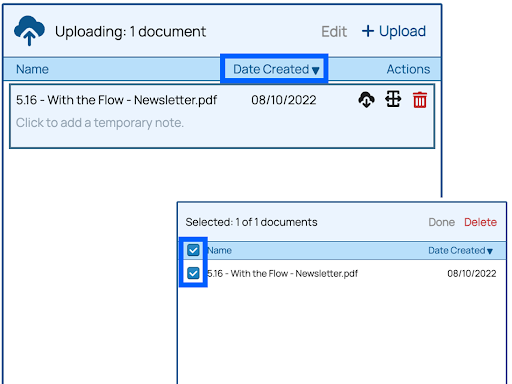
The #1 requested enhancement from users was a better way to manage documents when uploading multiple documents all at a time. For example, many organizations want the ability to sort documents by date when uploading, and then from there, select documents created within a specific date range. With version 5.16, you can now easily sort documents and locate what you are looking for, then select or remove documents from your list that you do not wish to upload.
In addition, several of the buttons on the Document Upload Screen have been updated so users can find what they need more easily. (Or, in the case of the trash can icon, red color has been added to draw the user’s attention to prevent accidental deletions.)

Improvements to Search Functionality
While document upload sets up your content repository for success, document search is the heart of workflows that use that content repository. To make search easier, we made it so that scrolling through search results now leaves the search criteria and other actions at the top of the window. This serves as a reminder of what is being searched and filtered and allows users to move between scrolling and action more seamlessly.
In addition, in some places, we’ve replaced words like “search options” with the word “filters” since that better reflects what is happening: Filtering search results to find specific documents.
Making Sense, Visually
The best software is easy to use because you never have to hunt for what you need when you need it. We’ve taken this principle to heart in making some design changes in version 5.16:
- Selection boxes now appear just to the left of the Action Menu dropdown, close to the document name. This makes it easier to see what is being selected without trying to track it across the screen.
- Icons have been updated—for example, the broom icon has been replaced by a button that simply says “clear,” and the trashcan icon is now red.
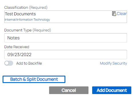
- Buttons now have consistent colors that reflect their importance. Primary Action Buttons are solid blue, Secondary Action Buttons are white with blue text and border, and Clear/Cancel buttons are solid gray.


There are other small changes, too, which help make the interface easier to use and navigate.
Streamlined Customer Support and Tutorials
At QFlow, we understand that putting technology before people only leads to problems. We want to make every feature in our software as user-friendly as possible, which sometimes means that the user needs a little extra help from the QFlow team.
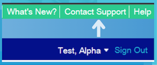
In version 5.16 of Q-Action, a new contact support form will be available at the top of your screen. This can be used to report issues, ask questions, or provide feedback about a screen or a feature. We hope that our users will take advantage of this feature to further improve the software and learn more about it.

And what about users who are new to the system? New users will now be welcomed with a brief tutorial to showcase basic functions. That tutorial can be played anytime by clicking “Help” and selecting “Restart Welcome Tutorial.”
Additional Improvements in this Release and Beyond
The above are just a few of the latest updates! For a complete list, please see the New Features in the Help section of Q-Action for more information about recent changes.
That said, it is possible that there is some new feature or design change you were hoping for but that we could not work into this latest release. If so, please tell us about it! Our new streamlined contact form makes it easy for you to share your needs and help influence the next version of Q-Action.
And just what is in store for the next version? Right now, we are currently hard at work creating even more enhancements to the user experience, all based on feedback from our users. Make sure you never miss an update—follow us on LinkedIn to get the latest from QFlow!
